Though it may be viewed as a useless subject, geometry carries truth. As one of the four quadrivial arts (arithmetic, geometry, astronomy, and music as taught in antiquity), geometry helps us understand the world as it relates to space: numbers and mathematics seen and understood in space. Geometry concerns such things as proportions and symmetry, as well as their opposites. Arthur Rackham (1867–1939) used it in all of his art.
The unique use of the geometric principles of proportion, shapes, and symmetry characterized Rackham’s illustrations. Through geometry, he conveyed characters’ personalities wordlessly. The characters’ outward appearance reflected their inner disposition and, thus, allowed Rackham’s viewers, specifically children, to register which characters to trust or distrust subconsciously.
Dissonance in Asymmetry
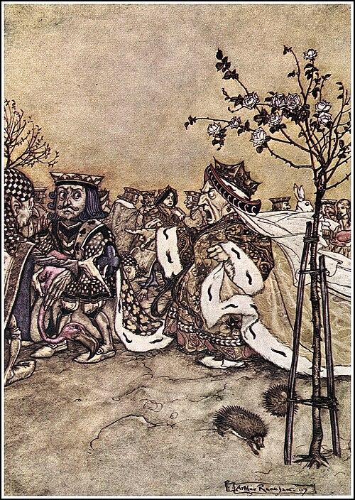
Rackham’s illustrations for “Alice in Wonderland” perfectly demonstrates his use of geometry to convey character personalities. In his illustration “A Mad Tea Party,” he showed Alice having tea with the Mad Hatter, the March Hare, and the Dormouse. Rackham drew everything fairly realistically, but differences in proportion and ratios are evident in the Mad Hatter and the March Hare. Their slight asymmetry symbolized mad, dreamlike characters. While Alice is a perfectly symmetrical and anatomically correct figure, the Mad Hatter’s head is far too big, his nose large and sharp, and his hands weirdly long and pointy. Similarly, the March Hare has an extremely large head with protruding eyes and human hands. Though not menacing, children can interpret these as characters’ alien, mad dispositions.Rackham’s illustration of the Queen of Hearts also perfectly showed his use of proportion. The queen has not only an extremely short body (symbolizing her small and petty character) but also an extremely large, masculine head. From this picture, children can conclude that the Queen is scary, temperamental, and untrustworthy.
Truth in Geometry
Rackham similarly used proportions and shapes to make the witch in the Brothers Grimm’s “Hansel and Gretel” look unearthly. While Hansel and Gretel are symmetrically perfect but little humans, the witch is stooped at an ungainly angle, her head is large and wrinkled, her nose is extremely large and oddly shaped, her jaw shows a clear underbite and frightening teeth, and her eyes are too small. The witch’s appearance help children to recognize her wickedness.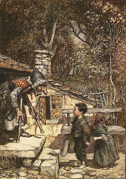
Even a slight variation in anatomical proportions can convey a character’s personality. Rackham’s illustration of Puck from “A Midsummer Night’s Dream” shows the reader Puck’s unique nature. Unlike the fairy beside him, Puck’s ears, eyes, and face appeared angular and sharp, suggesting a devious and tricksy character. A child could have read his intentions without reading the play.

Thus, by placing characters who were perfectly and proportionally drawn next to those who were disproportionate (even if only minutely), Rackham demonstrated not only the innate role that geometry plays in the human mind, but also how physical proportions helped him display the proper or improper proportions of a soul’s disposition.

Public Domain
Rackham’s art embodies what Stephen M. Barr says in “Modern Physics and Ancient Faith”: “Symmetry contributes to the artistic unity of a work, to its balance, proportion, and wholeness. The connection between symmetry and unity is exceedingly important and applies also to symmetry in physics.”
Thus, Rackham taught children the value of balance and symmetry intuitively. Symmetry and balance bring wholeness and unity, which, in turn, aid the soul in achieving the true, the good, and the beautiful.