This copy is for your personal, non-commercial use only. Distribution and use of this material are governed by our Subscriber Agreement and by copyright law. For non-personal use or to order multiple copies, please contact The Epoch Times Reprints.
Most of us can recognize our favorite brands from their logos alone. That’s not accidental! Brands often spend a huge amount of time, money, and resources coming up with a logo that will eventually take on iconic status and be universally recognizable.
But what are the secrets behind the signs? Here are 10 famous brand logos and the fascinating stories behind their inception.
“Wiki” is Hawaiian for “fast” or “quick.” This prefix came together with the concept of a worldwide encyclopedia to form “Wikipedia.” But did you know that the Earth-shaped puzzle pieces of the brand’s logo represent multilingualism?
Each piece is stamped with a letter or character from a different language. The missing puzzle pieces represent incomplete knowledge, the articles and the languages not yet added.
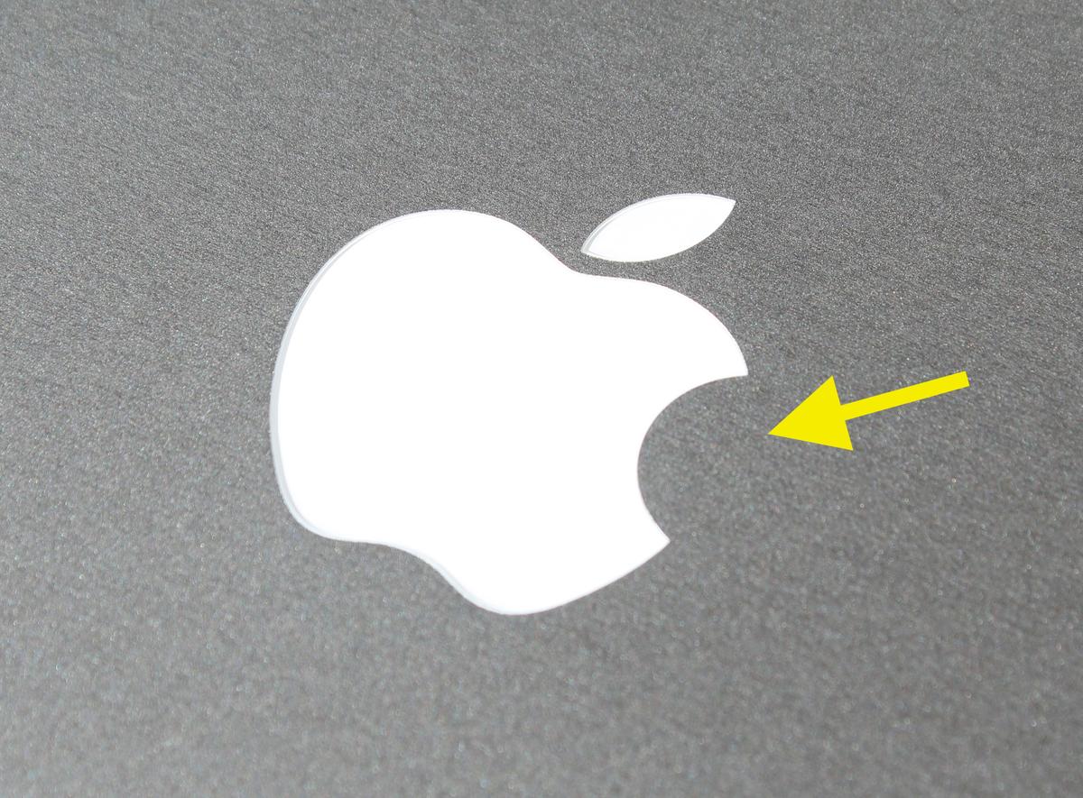
Alan Turing’s biographers speculated that the young mathematician ended his own life by biting into an apple that had been laced with cyanide. However, despite its popularity as a theory, this is not where the inspiration for Apple’s logo came from.
Logo designer Rob Janoff simply claimed he incorporated the bite mark “to make it look more like an apple and not some other round fruit. I did what one does with an apple,” Janoff said, as quoted by Logo Design Love. “I took a bite out of it.”
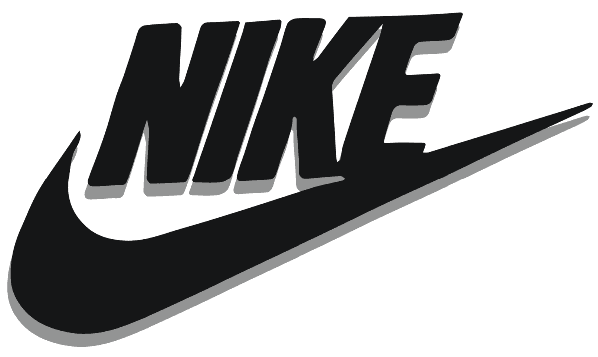
Nike owner Phil Knight paid Portland State University student Carolyn Davidson $35 to come up with the now-infamous “swoosh“ in 1971. Little did he know at the time, the logo would become iconic.
The “swoosh,” designed by Davidson “to convey motion,” is easily associated with Nike, the Greek goddess of victory; the sweeping design emulates one of the goddess’s wings. Today, the Nike swoosh is the most valuable brand logo in the world, valued at an astonishing $26 billion.
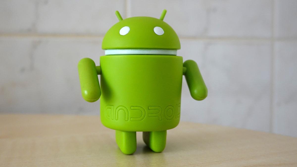
While the Android-versus-iOS debate may long continue, there’s no doubt that the origin of the Android logo is clear cut. Graphic designer Irina Blok claimed that the logo we all recognize a mile away is familiar for a reason, according to The New York Times; the friendly-looking green robot was inspired by the silhouettes we usually see labeling public restrooms.
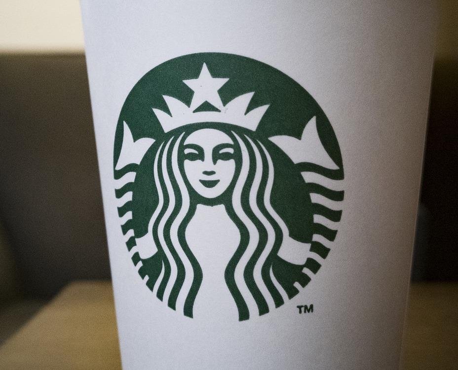
America’s favorite coffee makers used to look a little different. The Starbucks mermaid was always holding both her tail fins, but the original version was a little more risqué. Inspired by the mythical Melusine, a two-tailed fish-woman hybrid, the 1971 logo bared all.
The Pepsi logo set the company back an estimated $1 million for a reason; it was designed upon an existing mathematical principle, the “golden ratio,“ which was adopted by several 20th-century artists and architects as a principle for aesthetic pleasure.
So there’s nothing accidental about the Pepsi logo’s pleasing lines. It was, quite literally, designed to be beautiful!
The sportswear company’s founder, René Lacoste, was nicknamed “the Crocodile” because of his formidable prowess on the tennis court. According to the International Tennis Hall of Fame, Lacoste was challenged by his teammate Alan Moore to win their next game; his “prize” was to be a handsome crocodile skin suitcase the pair had noticed in a shop window.
Lacoste didn’t win, but a journalist got wind of the anecdote and made it famous, saying that the young player “fought like a crocodile.” Lacoste later designed his company logo based on this compliment.
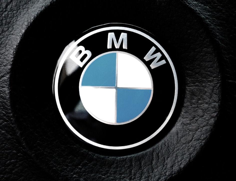
Some people believe that the colors in the BMW logo represent the elements of water and air; some believe the shape emulates a plane propeller. But neither of these are true despite the fact that the propeller motif was actually used in a BMW advertisement in 1929.
The New York Times says that the blue and white segments simply represent the colors of the Bavarian flag.
The logo of this social-media-cataloging site is cleverly designed to emulate its own name. The first letter, “P,” closely resembles the type of pin you might use to affix a picture to a pin board; this is precisely what Pinterest is for, of course, except the “pinning” is done electronically.
10. Metro-Goldwyn-Mayer
Film buffs everywhere may know that the Hollywood film studio Metro-Goldwyn-Mayer (MGM) has used “Leo the Lion” as their mascot since 1916. An internet meme convinced many people that the studio had employed some questionable tactics to get Leo to roar; the video above will reveal whether or not that rumor is to be believed!
There are so many stories behind the familiar signs that adorn our daily lives.


