
While bright and bold colors work perfectly in fun spaces like children’s bedrooms and playrooms, they can also work seamlessly in living spaces. In general, go for bright and bold when faced with spaces that may not get much light or are overly dark, as these lively colors can serve as a welcomed energy boost.
When looking to incorporate bold, bright colors into your space, here are some Design Recipes do’s and don’ts.
Do’s
Do use the colors you love in your space.
Do consider citrus colors such as orange, lemon and lime as these colors tend to be vibrant, happy and bright.
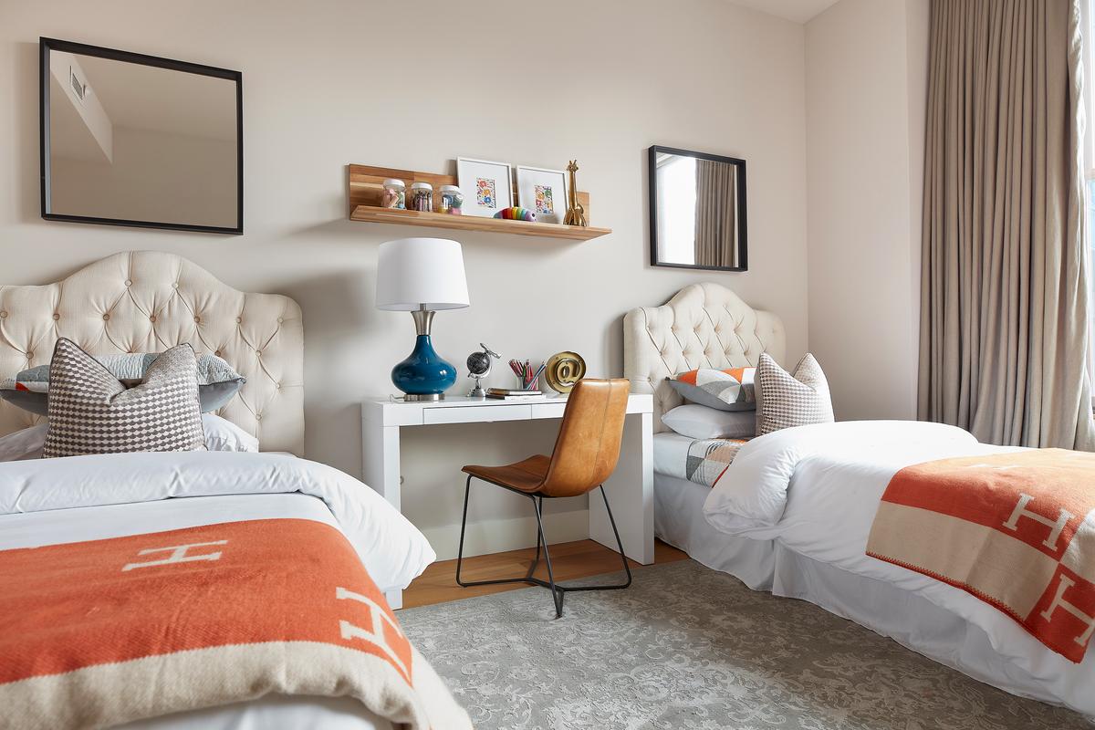
Do mix negative space into your room such as leaving trims, baseboards and some wall areas white. The negative space will help make your color pop.
Do consider using your vibrant color as an accent wall or highlight.
Do use bright colors in your accessories such as decorative items and artwork.
Don’ts
Don’t use too many colors in a space. Incorporating two to three is a good rule of thumb. Less is more.
Don’t rule out blending your vibrant colors with neutrals such as white, brown, gray or black. They can help create a sense of contrast.
Don’t forget to consider bright colors in areas such as bathrooms and kitchens.
Don’t follow trends. When considering which bright colors to use in your space, choose those that are more timeless instead of trendy.
Don’t forget to map or repeat a color throughout various parts of your home, as this will help you tell a cohesive color story.
Cathy Hobbs, based in New York City, is an Emmy Award-winning television host and a nationally known interior design home staging expert and short-term rental/vacation home designer with offices in New York City and The Hudson Valley. Contact her at [email protected] or visit her website at cathyhobbs.com. Copyright 2023 Tribune Content Agency, LLC.