By Aubrey Young
From Tribune News Service
With less than a month until Christmas Day, we are in full swing holiday mode. But I wanted to take a little break from the Christmas craziness and fill you in on our recent trip to the High Point Market, the world’s largest home furnishings trade show, held each year in High Point, North Carolina.
In late October, our design manager, Carlie, and I headed to High Point to do a bit of shopping. High Point is one of the markets we visit each year to source products for our shop and get inspired for the upcoming seasons. It’s a lot of work and a ton of fun! It’s inspiration overload by the end of each day; our feet are aching and our imaginations are running wild.
One of my favorite things to do at the market is spot new trends. At our core, we are new traditional and love to celebrate classic styles in fresh ways, and trend spotting is one of the ways we can keep our traditional roots current. Here are a few of the things we spotted as we shopped this October.
Quiet Color Palettes
While we typically see a range of color palettes each year, we did see quite a few soft color combinations. Think layered neutrals and dusty tones, earthy browns and organic greens and blues. These spaces invited us in and inspired moments of calm in the chaos of the show. In a home setting, these palettes envelop you in a calm coziness that make you want to stop and stay a while. This is something we can appreciate, especially today. Whether layering warm neutrals or mixing in soft colors, this concept can be taken in a number of directions while still achieving the same effect.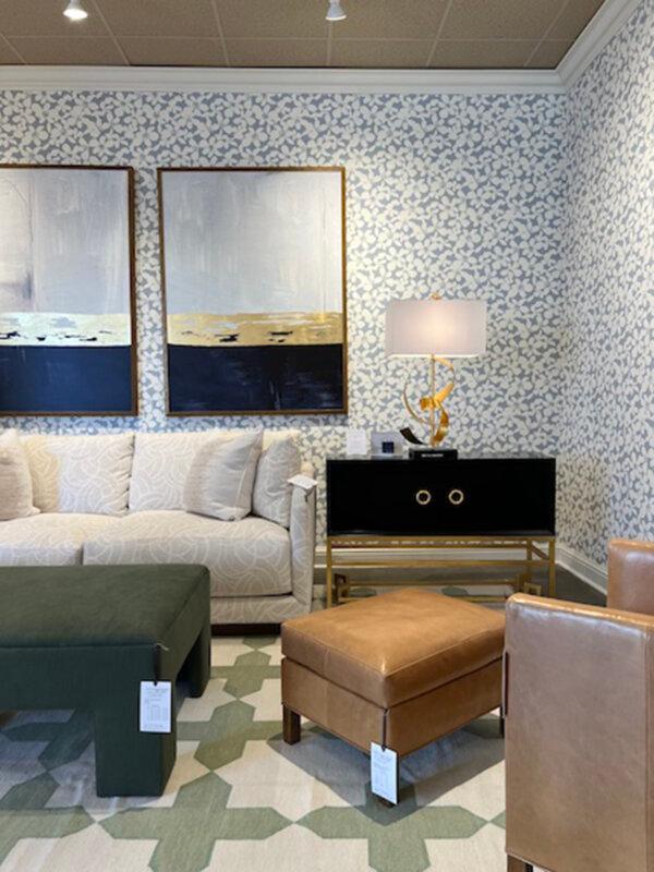
Soft color palettes envelop you in a calm coziness that make you want to stop and stay a while. Provided photo/TNS
Reeding
Reeded furniture and accents were making a statement! From accent walls to furniture side panels to table bases, this texture was everywhere. The opposite of fluting, reeding is made up of a series of vertical convex moldings (I think of dowel rods cut in half length-wise and bunched side by side) grouped together to create texture. We spotted this concept in a variety of sizes, from miniature to oversized, each offering a different aesthetic. The ancient Greeks and Romans were fans of both fluting and reeding and we love to see such classic elements being incorporated into contemporary pieces.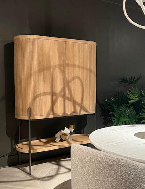
Reeded furniture and accents are made up of a series of vertical convex moldings grouped together to create texture. Provided photo/TNS
Marble and Travertine
While we saw these materials more frequently on pieces that skewed more contemporary, we spotted lots of marble and travertine stones, especially for table tops and table/base combinations. Natural stone is a great way to mix up the textures in a space, especially when you, like we do, like to cover everything in upholstery and fabric! It also adds an organic touch, regardless of the piece’s shape. These make great statement pieces and accent pieces alike.High Contrast Palettes
Perhaps the opposite of the soft palette, the stark contrast of black-and-white (or simply dark-and-white) was something we spotted throughout. These high contrast settings make for bold spaces that draw in your eye, and have a dramatic visual impact. This look can be toned down with natural elements like unstained wood pieces and oversized upholstery or made more formal by incorporating high gloss burl or rich, dark mahogany wood pieces and more structured upholstery. A dark wall with white or cream furniture and light flooring pops, and we especially loved an oversized piece of art hanging on top of a contrasting wall.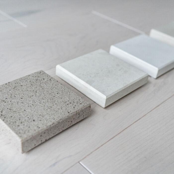
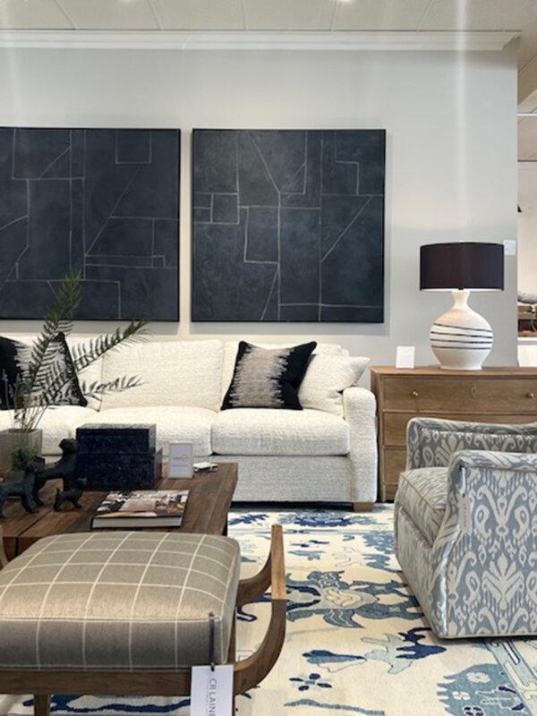
High contrast settings make for bold spaces that draw in your eye. Provided photo/TNS
Green and Brown Color Palettes
I’m always a fan of earthy tones, but we loved spotting brown and green combinations across the show. These colors were styled in both casual and formal settings each with a unique personality. This color palette can skew formal or casual, often taking direction from the types of textiles selected (think block prints for a more casual setting and velvets for a more formal look) and is wonderfully grounding, regardless of the space’s formality.Adapted from nellhills.com. Katie Laughridge is the owner of Kansas City interior design destination Nell Hill’s. For more information, contact Katie at [email protected]. Copyright 2023 Tribune Content Agency, LLC.
Dear Readers: We would love to hear from you. What topics would you like to read about? Please send your feedback and tips to [email protected].