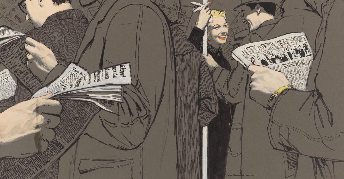
NEW YORK—At age 101, McCauley “Mac” Conner doesn’t quit. Despite losing sight in his remaining good eye, he is illustrating an upcoming children’s book.
Conner was, and still is, a marvel of consistent artistic output and diversity of vision. Between the late ‘40s and early ’60s, before America developed its permanent fixation for the television screen and glossies became reliant on studio-lit photography, Conner illustrated numerous editorials and ads for such beloved periodicals as Redbook, Colliers, Good Housekeeping, and McCall’s.
As regularly as these magazines landed in mailboxes, millions of Americans saw Conner’s work, whether it illuminated serial narratives and essays or goaded the eye to linger on ads. His gouache-on-board paintings—each one a product of long back-and-forths between art director, agent, and artist—carry a recognizable Rockwellian feel, but also an edge all Conner’s own.
Only half of Conner’s enormous body of work survives, estimates Terrence C. Brown.
Brown was the director of the Society of Illustrators between 1984 and 2008 and the curator of the first Mac Conner retrospective, which has opened at the Museum of the City of New York.
By the standards of today’s (relatively) intellectual property-conscious artists, half doesn’t sound like a lot. But back then, commercial artists like Conner weren’t so sentimental about the products of their labor.
If it weren’t for the insistence of Conner’s agent Bill Neely that he keep his original artwork, much more of it would have ended up in the dumpster, as so many illustrations did after they fulfilled their purpose.
“I’m going to say that one-tenth of one percent of all the artwork created for publication [from any artist]—ads, books, magazines, from 1900 to 1975—still exists,” Brown said. “Advertisers had no use for it once they lost the account, and artists didn’t want it back.”
Collaborative Process
Today, illustrators treat their completed works much more like fine artists do. The smart ones make digital copies and store canvases in climate-controlled settings. In the complex workflow of Conner and his contemporaries, the original drawings played just a small part.
“In Mac’s era he would receive a manuscript, a story from the art director,” Brown explains. “He would read it. Perhaps the art director would circle a few lines [for Mac to focus on]. He would then do a couple of pastels, present those to the art director ... and do a finished drawing. He would then engage models at the studio and shoot the various aspects of the image. From those photographic references, he'd make the final painting and deliver that to the magazine. ... The photographer would then capture the image for the press.”
A similar, many-handed process existed with advertising work.
Several projects on display are accompanied by letters from clients addressed to Neeley. These sellers of cars, air travel, and air conditioners write at length about what parts of an image they want emphasized, colors to use, visual features to include, emotions to invoke, as well as details to avoid.
About a series of ads in which female secretaries struggle with administrative tasks made difficult due to the lack of proper ledgers and receipt books, an executive at N. W. Ayer & Son representing Moore Business Forms wrote:
“We want to get as much sex appeal into these girls as possible without making them look cheap. In other words, despite the consternation in the faces of the women shown, we want to them to be really attractive.”
Though the quality of the art speaks for itself, the concept is only as good as the brainstorming of ad execs. The resulting ads have the ever-so-slightly sterile feel of illustrated airplane safety manuals, compared to illustrations inspired by the drama and nuance of fiction.
Still, it’s impossible not to appreciate the superiority of such carefully considered ads to the giant-airbrushed-face-and-textbox ads we’re accustomed to today. This was an era in American advertising when solicitations actually solicited, sometimes in too-saccharine paragraphs, instead of lording over us with steely one-liners of noninformation that intimidate more than engage.
Supporting the Story
A significant part of the show centers on editorial and fiction. Given more room to roam, artistically speaking, Conner experimented with texture and perspective. Some pieces retain the sketchy feel of the initial pastel rendering, while others look smoother and more finished. Others feature a flatness akin to that of Japanese woodblock prints.
Conner loved to play up contrast, whether it be in hue or value. In one painting, he lets the main characters’ pink, smiling faces be the only color in a sea of gray. In others, he rid a scene of mid-tones to create a dramatic chiaroscuro.
Sometimes his creativity shows itself best when working under financial constraints, like two-color printing. The sheer diversity of Conner’s creative vision made him one of the most desired illustrators of his time.
Because many of the magazines regularly featured romance, intrigue, and whodunits, Conner’s editorial paintings often centered on couples.
His women were soft, lovelorn, jealous, vicious, or a mere step away from ruin—but always scarlet-nailed and impeccably dressed. His men, typical of the 1950s conception of masculinity, were either well-meaning paternal types or dangerous back-alley criminals.
An entire section of the exhibit is dedicated to the Cold War-fueled anxieties of the time. Fear of hostage-takers, murders, teen mobs, armed hitchhikers, even the supposedly deleterious effect of comic books on youngsters—all of it made good reading and even juicer pictures.
Dedicated working artists evolve, even if the people or institutions they work for don’t. By the ‘60s, readers had gotten fed up with the predominantly WASP concerns and amusements that dominated magazines. The Civil Rights movement had come to a head, but editors had gotten comfortable in their bubble.
After the ‘80s, Conner turned his brush to illustrating educational publishing and paperback covers. Today, Brown said, the landscape for print illustrators is still alive and well, but tucked away onto the pages of less mainstream magazines like the Atlantic, Mother Jones, Texas Monthly, and Rolling Stone.
“There are still publications that hire the best illustrators, have good budgets, and very good art directors, and that’s the key,” Brown said.
Mac Conner: A New York Life
Sept. 10–Jan. 19, 2015
Museum of the City of New York
1220 Fifth Ave, New York, NY 10029
$6–10.
mcny.org


