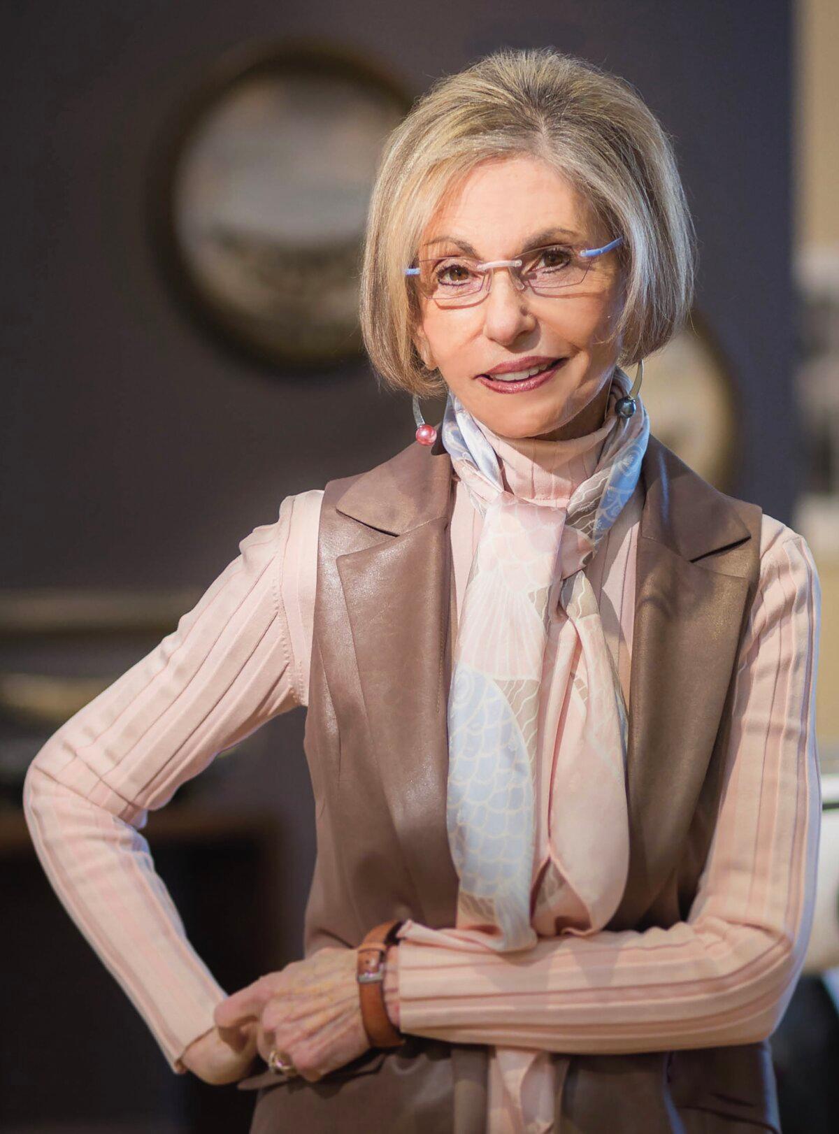
Leatrice Eiseman can tell you which color to wear to boost your chances of succeeding in business or love, which tone to paint your bedroom to secure a good night’s sleep, and which hues to use to motivate your staff. As a color specialist, director of the Eiseman Center for Color Information and Training, and executive director of the Pantone Color Institute—where she heads the committee that selects its hugely influential Color of the Year—her expertise is recognized internationally.
For 2024, Pantone chose a gentle, pastel orange color called “Peach Fuzz.” The color represents our “innate yearning for closeness and connection,” Ms. Eiseman said in Pantone’s announcement. It also exudes warmth and compassion, she added.
After studying psychology, counseling, and design, a serendipitous encounter gave Ms. Eiseman the opportunity to turn her passion for color into a career. Now, her clients span individuals wishing to know which colors flatter them, homeowners seeking inspiration for their interior design, and global companies seeking advice on new products, branding, and advertising campaigns. Color, as she succinctly puts it, is the silent salesperson.
Ms. Eiseman spoke with American Essence about the complexity of color psychology, predicting Barbie pink, and her perfect shade for a bedroom.
In 1999, we launched our Color of the Year initiative. We nominated Cerulean Blue, with no expectation of where it would lead. Today, the Pantone Color of the Year gets great media coverage and is hugely influential, advising companies on critical decisions about product or branding as well as inspiring people to redecorate or introduce a splash of that color—a cushion or throw, say, or a scarf—to their homes or wardrobes. At the very least, it makes them think beyond the rainbow shades.

Aside from what’s happening in the world, we also look at fashion, film, art, and show business news. Blockbuster films such as “Barbie” play a part, though often we will have been way ahead of those curves: Our Pantone Color of 2011 was Honeysuckle, which is pretty close to the exuberant Barbie pink shade made popular by the film.
How we respond to color depends on culture, upbringing, and even life experiences. For instance, I’ve had clients tell me they hate a particular color, even though it really suits them, without knowing why. I’ll probe into their background, and it turns out that that color was a favorite of a much-loved relative who had passed—or that they had fallen off a bicycle that had been that exact shade. Once they trace the root cause, their aversion often disappears.
While there is no one definitive formula for making absolute assertions about color, we can make fairly accurate generalizations: Blue for tranquillity, orange for energy, yellow for cheeriness, purple for creativity and opulence. We respond to color viscerally or subliminally, and there are some obvious explanations for why some are more popular than others.
Sky blue is a good example. It’s enduringly appealing, full of promise, which comes from its powerful associations with the outdoors, with limitless possibilities—as in blue-sky thinking—and with high days and holidays. Our emotional response to it is almost universally positive.
Red is the color we often see in nature when animals are ready to mate, and it can also be a sexual signal in humans. Our cheeks might flush when we like someone, and a femme fatale is typically shown with scarlet lips and nails. Closely aligned to this is red’s association with danger.
However, not all reds deliver the same message. In every color family, there are varying tonalities based on the value and intensity of the specific shade. So, although a bright red would not be appropriate for a job interview in a conservative field such as banking, a plum or wine red would be just as suitable—and perhaps more impactful—than the more conventional business grays or dark blues.
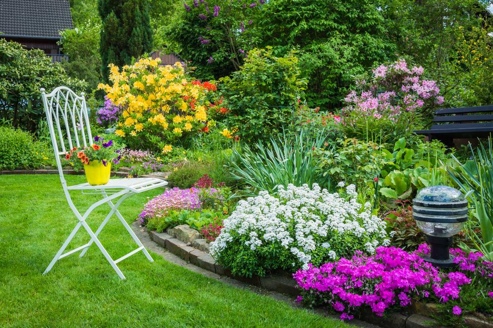
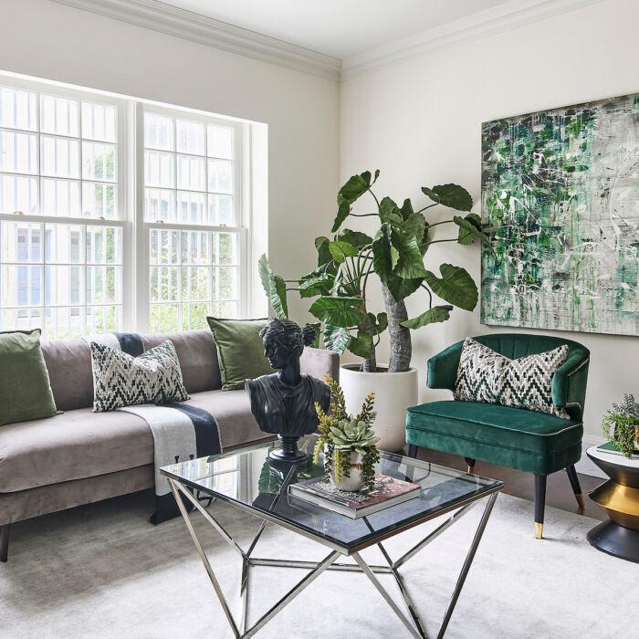
If you’d like to create a grounding effect in those around you, go for a green or brown—colors from nature make people feel safe and supported, and again, this has mainly to do with association. Who doesn’t feel strengthened by standing next to an ancient tree, or walking in a forest with foliage underfoot?
Very often, people are too cautious to veer too far off this spectrum, and end up using different tonalities throughout the house. This is fine, of course, but I like to encourage them to be a little more adventurous. If you’d like to energize your social spaces, such as your kitchen, choose warm oranges, reds, and yellows. A mild red—like Pantone’s Salsa—works well in the dining room, since this is said to stimulate appetite.
As guidance, I suggest a 75 percent to 25 percent ratio between cool and warm colors. If your preference is for the former, then introduce warming accents of red, orange, and yellow. Conversely, if you’ve gone for the latter, you can take the temperature down with blues or greens. Accessories are a really easy way to do this: Tan furniture and brass lamps look wonderful set against walls of midnight blue; experimenting with paintings, rugs, and plants is also a good way of seeing which colors work together. Let nature be your guide. It’s a great inspiration.
Where I lived previously, on Bainbridge Island [in Washington state], the skies are gray for much of the year, so yellow features—the color of sunlight—were prominent in my home. I used Pantone’s Golden Haze in the living room, and other tones of yellow in other spaces to add warmth and brightness and, above all, to make me and my guests feel happy.
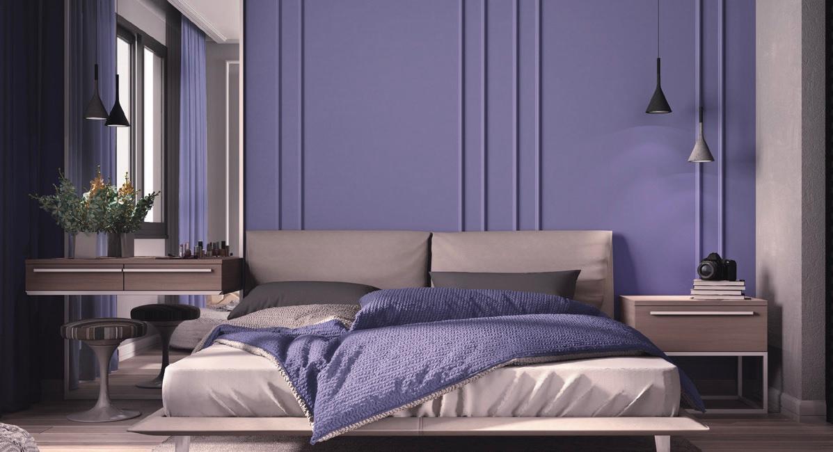
I now have a mission-style adobe house in Tucson [Arizona], where I have used some of the gorgeous Southwest sunset colors of warmer earth tones, including tans, peach, apricot, and soft yellow greens, and counter-balanced them with twilight blue and magenta. My master bedroom is Pantone’s Very Peri, a periwinkle shade that brings together the tranquility of blue and the drama of purple. It’s a warm blue—and for me, the perfect shade for a bedroom.
The same goes for your wardrobe. If you’re unsure, start with accessories. A scarf, necklace or earrings, a tie—something you can hold up against your face. The key to finding your best colors lies in your hair, skin tone, and eyes.