
By Cathy Hobbs
From Tribune News Service
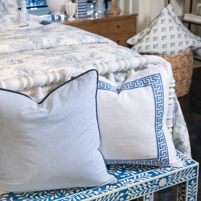
A designer technique called color blocking, or color mapping, is a trick of the trade that, if used effectively, can help create a space that is colorful and cohesive without it becoming overwhelming.
When using this technique to elevate your space, keep these three basic steps in mind:
- Pick a color to serve as the foundation for your color story.
- Repeat the color in various ways throughout the space.
- Create interesting opportunities to repeat color such as through artwork, upholstery, accessories and accents.
Do’s
Do begin by choosing the colors with which to create your color palette. Typically selecting two to three colors is best.Do incorporate other elements in the space that include your color palette, such as artwork, area rugs, accessories, accents and even books.
Do repeat and map your colors, sprinkling them throughout a room.
Don’ts
Don’t choose colors that are all the same shade. It is acceptable to choose tints, tones and shades of a color.Don’t forget to incorporate negative color space in a room. Leaving “open” color opportunities will help colors that are present to shine.
Don’t avoid colors such as black and white. These colors not only help create an elegant sense of contrast, but are also great foundation colors for modern design.
Cathy Hobbs, based in New York City, is an Emmy Award-winning television host and a nationally known interior design home staging expert and short-term rental/vacation home designer with offices in New York City and The Hudson Valley. Contact her at [email protected] or visit her website at cathyhobbs.com. Copyright 2023 Tribune Content Agency, LLC.