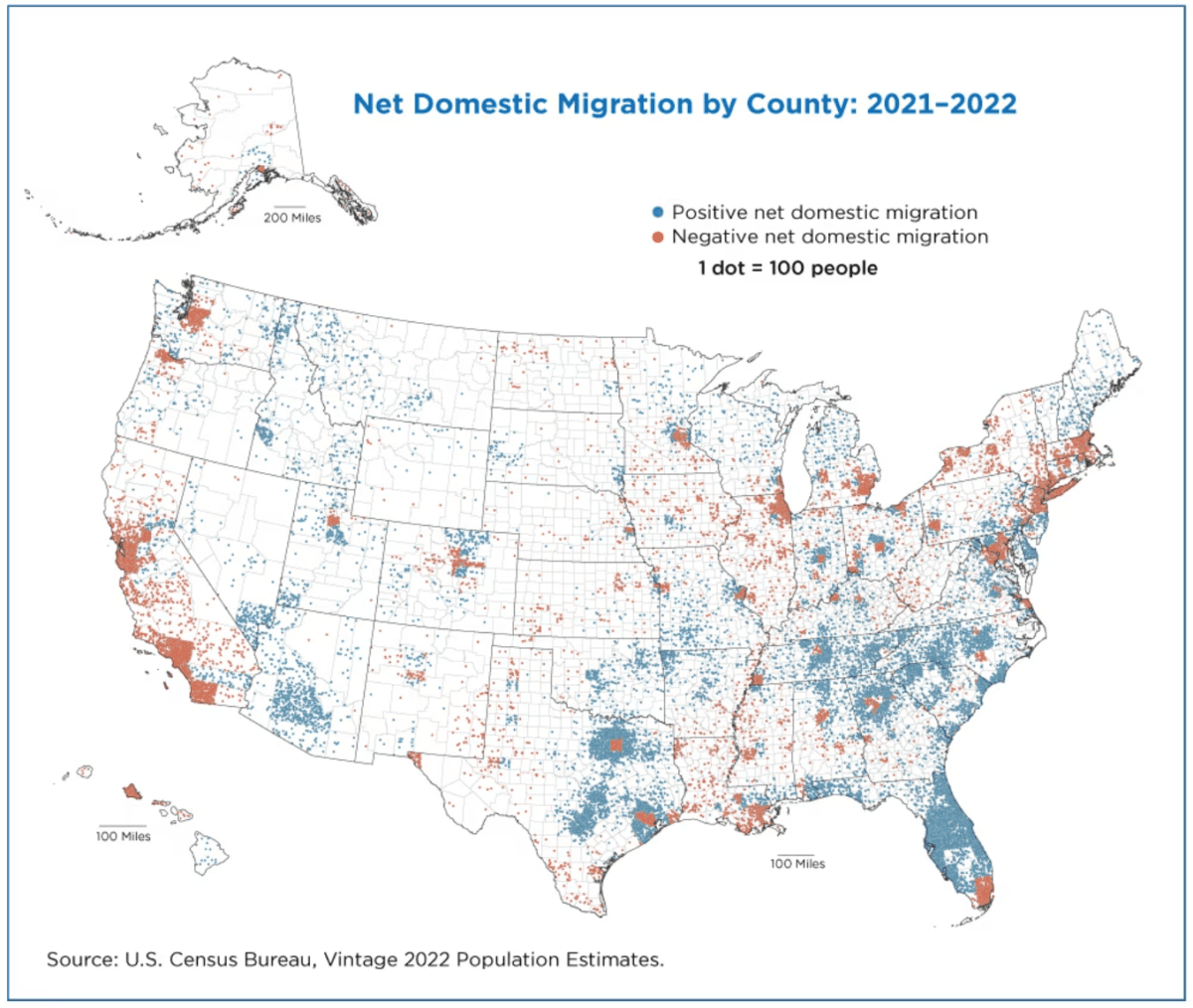
Americans are leaving in droves from the leftist, socialist cities and heading to areas with conservative state and local leadership. Before we examine California, just look at everywhere else: Detroit, when I was born there in 1955, enjoyed a population of 1.6 million. Now it’s down to 600,000, and keeps dropping.
Minneapolis was a beautiful city until 2020. But when leftist city and state leaders refused to quell the riots following George Floyd’s killing, with many buildings burned to the ground, it deteriorated rapidly, and people fled.
The Acela corridor in the Northeast—Washington, D.C. to Boston—also saw massive departures. All those cities and states have been ruined by leftist governance. In Nov. 2021, Virginia elected conservative Gov. Glenn Youngkin, so it may have a chance at recovery.
Even some large cities in conservative states people are moving to, such Texas and Florida, are seeing people flee. Dallas and Houston are red dots of people leaving, surrounded by blue-dot suburbs that have become refuges.
Florida has become so attractive, its big cities, such as Tampa and St. Petersburg, have enjoyed growth along with the smaller cities, with one exception—Miami, which people are leaving.
Denver, where many Californians moved to avoid the consequences of Golden State leftism—but then voted for leftist state and local politicians—now is a place to leave. Although much of the surrounding area still is growing.
California Exodus
Let’s turn to California. Here’s an isolated view of the Southwest.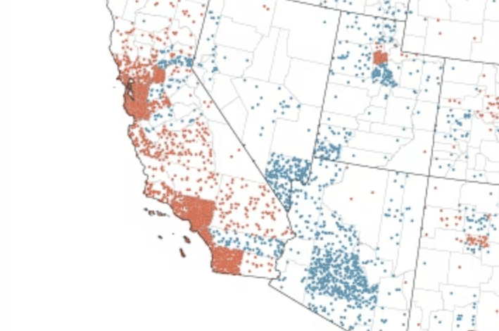
It’s just a mass of red dots, where people are leaving everywhere along the Coast. Some are moving inland to Riverside County, the only area in Southern California with blue dots. The incredible weather just isn’t enough to counter the state’s sky-high housing prices, record high taxes, failing schools, thousands of ridiculous new state laws, bizarre cultural decomposition, and general malaise.
Despite the desert heat, almost every area in Nevada and Arizona is growing, including their large cities of Las Vegas and Phoenix. Low taxes attract business, jobs, and people. California’s top income tax rate is 13.9 percent, with even the middle class paying 9.9 percent. Nevada has no income tax. Arizona’s flat income tax is just 2.5 percent.
COVID’s Effect
The map’s years, 2021-22, of course came after the COVID-19 pandemic hit in 2020. Here’s the U.S. Census analysis from their report:“Some longstanding trends accelerated, such as outmigration from large urban areas in the Northeast, while other trends reversed, resulting in some small rural counties gaining rather than losing population.”
Conclusion
Americans always have been highly mobile. Don’t like it where you are? Move. It’s a little dismaying the main three areas I’ve lived in, except when I was in West Germany while in the U.S. Army, all are shrinking: Detroit, Washington, D.C., and Orange County, Calif. Was it something I said?That means the exodus only will accelerate.