With the stock market having escaped January in one piece, all eyes in the market will now be turning to the month of March. When the snow starts to melt, thoughts of spring occupy people’s minds, and the FOMC meets for their second meeting of the year.
This will be the big one. The meeting where they decide to start hiking interest rates.
Since the Fed got serious about inflation, the stocks have behaved pretty well. An initial 25 basis points is already pretty much built into the market with the mega-cap tech companies that have held indexes together for most of the past year finally starting to take some profits.
The good news is that within six months of a Fed rate hike, the stock market is typically back up over 50 percent of the time.
The bad news is the stock market and the economy are no longer in any way connected.
Whatever the Fed is planning, little good will come from an extended tightening cycle where the economy is concerned. Even if they have the intestinal fortitude to raise interest rates enough to actually get inflation under control, there are still going to be problems.
The economy is basically addicted to cheap capital. And raising the price and scarcity of capital just as the world is trying to recover from a pandemic lockdown is not a recipe for success. (At least not what it needs to spur real growth.) Hiking rates aggressively enough to stall inflation will put us back on the precipice of another recession.
The Economy’s Crystal Ball
If you’re not familiar, the yield curve is a line that connects the yields of different maturations on similar debt instruments. Put a little more simply it’s the difference between longer and shorter term interest rates.If you look at a yield curve on a chart, where the horizontal axis represents time and the vertical axis represents yield, a “normal” yield curve will typically slope from lower left to upper right. This is because under normal, healthy economic conditions investors typically demand higher returns the longer they are asked to commit their money.
But yields aren’t static. And like any other market the yield curve can change shapes. And when it does, investors need to take note.
The yield curve is a remarkable tool for predicting policy errors by the Fed. How it works is pretty simple. It’s a bit like the difference between betting in Las Vegas versus betting at Churchill Downs.
When you gamble at most tables in Las Vegas, it’s you against the house and the odds are pretty much fixed, ever so slightly, against you.
But … head to Churchill Downs or any other racetrack, and it’s a different type of betting. “Parimutuel” betting is you betting against the other bettors in the race. The odds of the horses will move up and down depending on how much money is bet on any horse relative to the total money in the pool. By watching the odds move as you get closer to post time, you can effectively get an idea of which horse the “smart money” likes. It’s a betting market.
The yield curve gives you the same basic insight.
When you watch the yield curve, you’re seeing the entire market putting its money where its mouth is. Shorter term rates are more sensitive to policy changes, while uncertainty about the future causes money to rush into what has always been considered the safe haven of long bonds (today the 10-year T-Note is the benchmark) pushing yields lower.
Plain as the Nose on Your Face
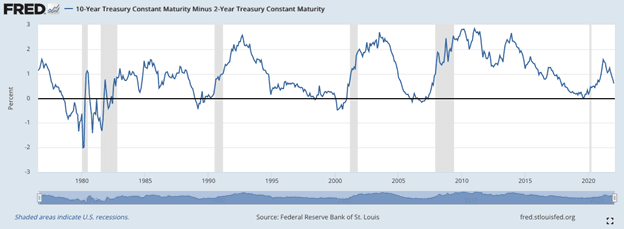
When tracking the yield curve, the difference between 10-year and 2-year yields (also known as the 10–2 yield spread) has pretty much been the gold standard for predicting coming recessions.Every time the curve inverts (when the spread between the 10- and 2-year yields goes negative) a recession followed in the ensuing months.
Look for yourself (recessions are indicated in gray)…
And here’s where we are today…
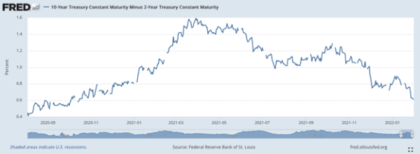
The yield curve has broken down precipitously, barely still in positive territory. This can only be pointing to one thing. Another policy error by the Fed and another recession in the coming months.
Smart investors will keep an eye on this golden indicator.
And should the curve dip below zero, investors can get ready by looking at more defensive stocks. Sectors like utilities (represented by the Utilities Select Sector SPDR Fund) and consumer staples (Consumer Staples Select Sector SPDR Fund, for instance) typically hold up the best.