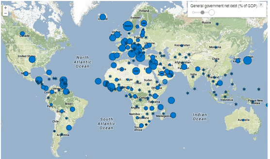
When talking about national debt, the numbers quickly become too big to fathom. The debt level of the U.S. government is now $17.3 trillion. But high national debt is far from just being an American problem. The whole world is now engulfed in debt.
Press the play button on the interactive infographic below, and the current state of world-wide debt will become vividly clear. Based on data from the International Monetary Fund, this infographic shows national net debts as a percentage of Gross Domestic Product since the 1980s. You can stop the presentation at any time to explore specific countries.
Net debt is calculated as gross debt minus financial assets corresponding to debt instruments.
The unbelievable proliferation of debt is even more striking when seen as a bar chart. Click the play button to see the progression over time—and the projection into the future.


