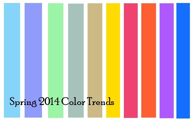
The intense colors of spring will be softened by a matte cover in 2014, making them look more submissive with a vintage tinge. Designers have taken a modern slant on the traditional spring palette by pairing soft pastels with vivid, bright shades to create a colorful equilibrium.
Take a look at the next season’s trendy colors and find which one of them will emphasize your beauty. To bring you the season’s most important color trends, Pantone, the global authority on color, surveyed the designers featured during New York Fashion Week and others.
Epoch Times previews the most prominent hues for spring 2014.
Starting with pastel background, we’ve got Placid Blue, like a picture-perfect, tranquil sky, it can bring peaceful calmness to your look.
Diverging from the blue purity, Violet Tulip is more romantic—a vintage purple that evokes wistful nostalgia.
With a similarly vintage tinge, comes the verdant shade Hemlock. It’s a beautiful pastel green, very different from the dominant greens of recent seasons.
You can pair any of these versatile pastels with a bolder hue for an au courant look. Hemlock matches well with Violet Tulip, or you can even combine all three pastels to create a gentle and calm, full look.
According to the color type, these pastels are among the “cold colors.” They generally suit the summer-type people (light-colored hair, blue eyes, pale skin) best, but they are still good for winter-type people (black/dark-brown hair and eyes, pale skin).
The two neutral shades are Sand, conjuring images of the beach and the carefree days of summer; and Paloma as the quintessential neutral, color of stones. They are interesting enough to be worn alone or combined with any color for sophisticated poise. Even just combining these two neutral shades can be very nice. Paloma can brighten the look of winter-type people and Sand is suitable more for summer-types.
To heat up and vivify the spring look, Cayenne, a high-pitched red, adds a dash of spicy heat to neutrals or any other color. Warming Freesia will intensify the feeling of first rays of spring sunshine. This warmth and energy helps set the stage for an optimistic Celosia Orange. You can match Cayenne with Dazzling Blue or also Cayenne with Celosia Orange, neutralizing them with Paloma.
The circle is complete with Radiant Orchid, dubbed color of the year, and Dazzling Blue, the polar opposite to Placid Blue. These strong, vibrant colors also pair well across the palette and can be mixed with either neutrals or pastels. If you love blue, pick Dazzling Blue and soften it with Placid Blue to make the ultimate blue sky look.
Although mixing colors to suit your type is sometimes similar to alchemy, the combinations below can set you in the right direction.
What Suits You
Types - Simple Version
Summer: Light-colored hair in sandy sort of shades, blue eyes, pale skin
Winter: Black/dark-brown hair and eyes, pale skin
Fall: Green, blue, or light-brown eyes, red or red-brown hair
Spring: Very bright-colored eyes, light-colored hair in vibrant colors like golden blond.
Celosia Orange, Paloma, Cayenne—great especially for fall types (brown, bright brown hair and eyes, or also green eyes).
Cayenne, Placid Blue, Paloma—the suitability of this combination is not so clear. Mostly it depends on its placing. It’s most important when worn near the face, so wearing this combination as a scarf or shirt/blouse, it would better suit the winter-type.
Freesia, Sand, Dazzling Blue—two sparkling colors, one neutral—this is great for winter-type people. but making Freesia with Sand dominant, it would also suit spring/fall type people.
Radiant Orchid, Violet Tulip, Hemlock—good for summer- and winter-type people (especially Radiant Orchid). Violet and Hemlock are more suitable for summer-types, but it’s not so definitive.
Hemlock, Freesia, Celosia Orange—this is great for spring- as well as fall-type people.
“This season, consumers are looking for a state of thoughtful, emotional and artistic equilibrium,” said Leatrice Eiseman, executive director of the Pantone Color Institute in a Pantone press release. The spring 2014 palette has a very gentle and smooth look, that can make your look delicate, yet very vivid.


