Color is arguably one of most dramatic ways to completely transform the look of a room.
While light, airy colors can open up a space, adding a breath of spring sunshine and fresh air to a room, dark, moody colors can have a mysterious and elegant effect. Bright, candy-colored hues are reminiscent of a summer day on the beach, and splashes of shimmery copper and reds can add a fiery burst of energy to a room.
Colors that are shaping up to find popularity this summer include warm, strong colors with subtle earthy undertones. Perhaps inspired by the warm, long days of summer, there are also plenty of very bold, vibrant shades. Here’s a look at five colors that are excellent options for summer, 2015.

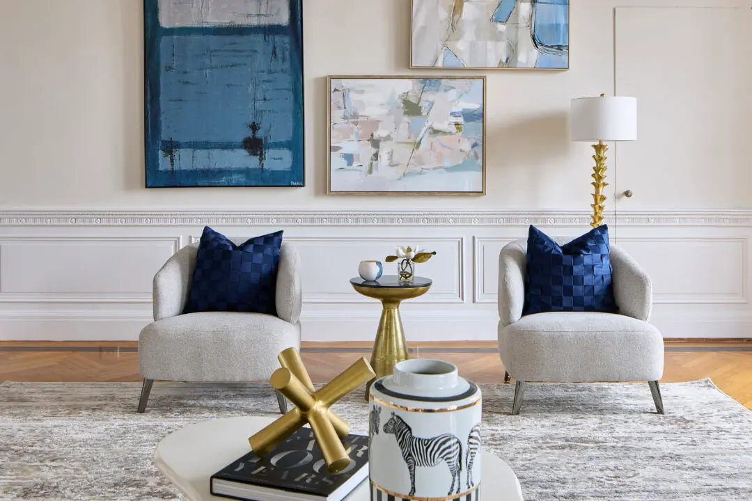
Brilliant Blues
Inspired by the blue of the Mediterranean or a cloudless sky, blues –including everything from ice blue to a strong cerulean are on track to make a splash this summer! Work this look by combining different shades of blue for a deep, layered look.

Citrus Green
Fresh as a cooling drink, citrus green makes a lovely accent color. Especially when paired up with yellow for a lemon-lime summertime look. You could also combine this color with other vibrant shades –like raspberry pink, and turquoise for an unmistakably summertime vibe.

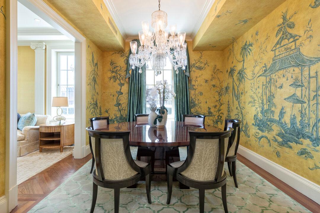
Lemon Yellow
Lemon yellow is bold, fresh color that works wonderfully when paired with pure white, or when used as an accent color to offset a blue color palette. If you’re uncertain about the vibrancy of lemon, instead opt for custard yellow –a subdued shade that’s still fresh enough to add summertime tones to your home.
Wine
Pantone’s color of the year is Marsala, a vibrant reddish brick brown. This color is an elegant, yet grounded statement color that works well to convey understated elegance, and warmth. Whether you do an accent wall in this shade, or look for wine colored fabrics to use as accent details for linens, throws, and table settings –you won’t go wrong with this strong, rich hue.
Muddy Tones
In stark contrast to some of the bright, vibrant colors that are on trend this season, muddy tones, like gray, black, or dark brown are great colors for summer 2015. They work especially well when paired up with white, or when used to offset bright, colorful accent colors.
Which colors are you planning to use in your home this summer?
Remember to LIKE Cathy Hobbs, Interior Designer on FACEBOOK, and Follow Design Recipes on TWITTER for more design tips and inspiration.
Top Image: www.secure.img.wfrcdn.com
Original Post: Cathy Hobbs Design Recipe