The Best Colors for Indoor Decor This Summer

The Best Colors for Indoor Decor This Summer
Cathy Hobbs
6/10/2015
Updated:
4/23/2016
Summer is a great time to showcase bright, vibrant shades and colorful pieces.

Summer is a wonderful time of year, and full of bright, cheerful colors, so why not celebrate this season by bringing some if these shades into your home? Here are some bold summertime colors for your inspiration.

View: <a href="http://www.ballarddesigns.com/lake-effect-art/wall-decor/art-by-subject/nature/349673">Lake Effect Art</a>
View: Lake Effect Art

Citrus Green

Fresh, vibrant shades like citrus green are perfect for summer. Painting an accent wall in this shade and bringing in some accessories in complementary hues is a sure way to add some spunk and style to your home. Pair citrus green up with sky blue or white for a fresh and cooling summertime vibe. You could also use multiple shades of green for a fresh, layered look and added visual interest.

Sky Blue

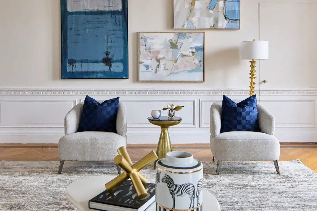
The color of the sky is a perfect summertime shade. Sky blue can help to create a relaxing, calming atmosphere, and works especially well when paired with white, or other neutral tones. Inject sky blue into your home with artwork, throw pillows, slipcovers, and even rugs.

View: <a href="http://www.houzz.com/photos/18397772/Cyan-Design-Teacup-Party-Contemporary-Decorative-Bowl-Small-X-50160-contemporary-decorative-bowls">Cyan Design Teacup Party Contemporary Decorative Bowl</a>
View: Cyan Design Teacup Party Contemporary Decorative Bowl

Sunset Orange

Much like the colors of a summer sunset, orange is a great shade for your summer décor. A strong and bold color, orange is sure to bring life and energy into your home.

Lemon Yellow

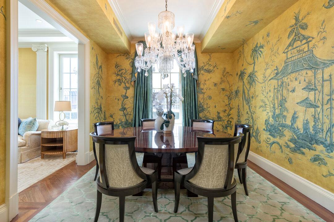
Lemonade, sunshine, and flowers! Lemon yellow is a happy, cheerful color that’s perfect for summertime décor. Throw pillows, drapes, and artwork are simple ways to incorporate this sunny shade into your home.

View: <a href="http://www.ballarddesigns.com/louis-xvi-63-inch-sideboard/10346">Louis XVI 63-inch Sideboard</a>
View: Louis XVI 63-inch Sideboard

Earth Brown

Finally, bright color palettes can benefit from a neutral tone to help round off the look and keep the entire color scheme grounded. Neutral tones, whites, and earthy browns are ideal for balancing out a vibrant color palette. Which summertime-inspired colors would you like to use in your décor?

Remember to LIKE Cathy Hobbs, Interior Designer on FACEBOOK, and Follow Design Recipes on TWITTER for more design tips and inspiration.

Top Image: Ballard Designs

Original Post: Cathy Hobbs Design Recipes 

5-time Emmy award winning television personality Cathy Hobbs (ASID) is the founder and creator of Cathy Hobbs Design Recipes™. Cathy currently hosts her own self-branded design television series, Design Recipes, airing on the top rated “PIX Morning News” on WPIX-TV in New York City. Cathy was a finalist on Season 6 of HGTV's Hit Reality Series "DESIGN STAR and most recently served for a year as the green expert for “The Life Improvement Squad” a national campaign with IKEA and O Magazine.
Author’s Selected Articles
Related Topics