

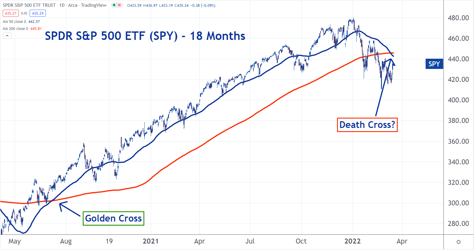
A “death cross” has formed on the chart of the SPDR S&P 500 ETF Trust. Traditionally, this is considered a bearish dynamic.
Technical analysts use moving average (MA) prices to identify trend changes. The death cross uses the average price of the prior 50 days and 200 days.
If the 50-day MA crosses below the 200-day MA, it could mean the market is at the beginning of what will be a longer-term downtrend. This just happened with SPY.
Conversely, when the 50-day crosses above the 200-day, it’s considered bullish. Analysts call this a “golden cross.” One formed on the chart in July 2020 and a long uptrend followed. The death cross may mark the end of it.
By Mark Putrino
© 2021 The Epoch Times. The Epoch Times does not provide investment advice. All rights reserved.


Friends Read Free